Ever wondered what vaccine adverse event data can tell us about safety trends and outcomes? Using the CDC WONDER database, I built a Power BI dashboard to break down years of vaccine-related reports into clear, actionable insights. Let me take you behind the scenes to show how it all came together—from raw data to polished visuals—and what the numbers are saying.
Vaccine Adverse Events PowerBi Dashboard
Press play to watch the video.
The Big Picture
The goal of this project was simple: make sense of vaccine adverse event data from 2019 to 2024. I wanted to understand patterns across demographics, manufacturers, and event categories like hospitalizations, deaths, and emergency visits.
To do this, I built a Power BI dashboard that highlights:
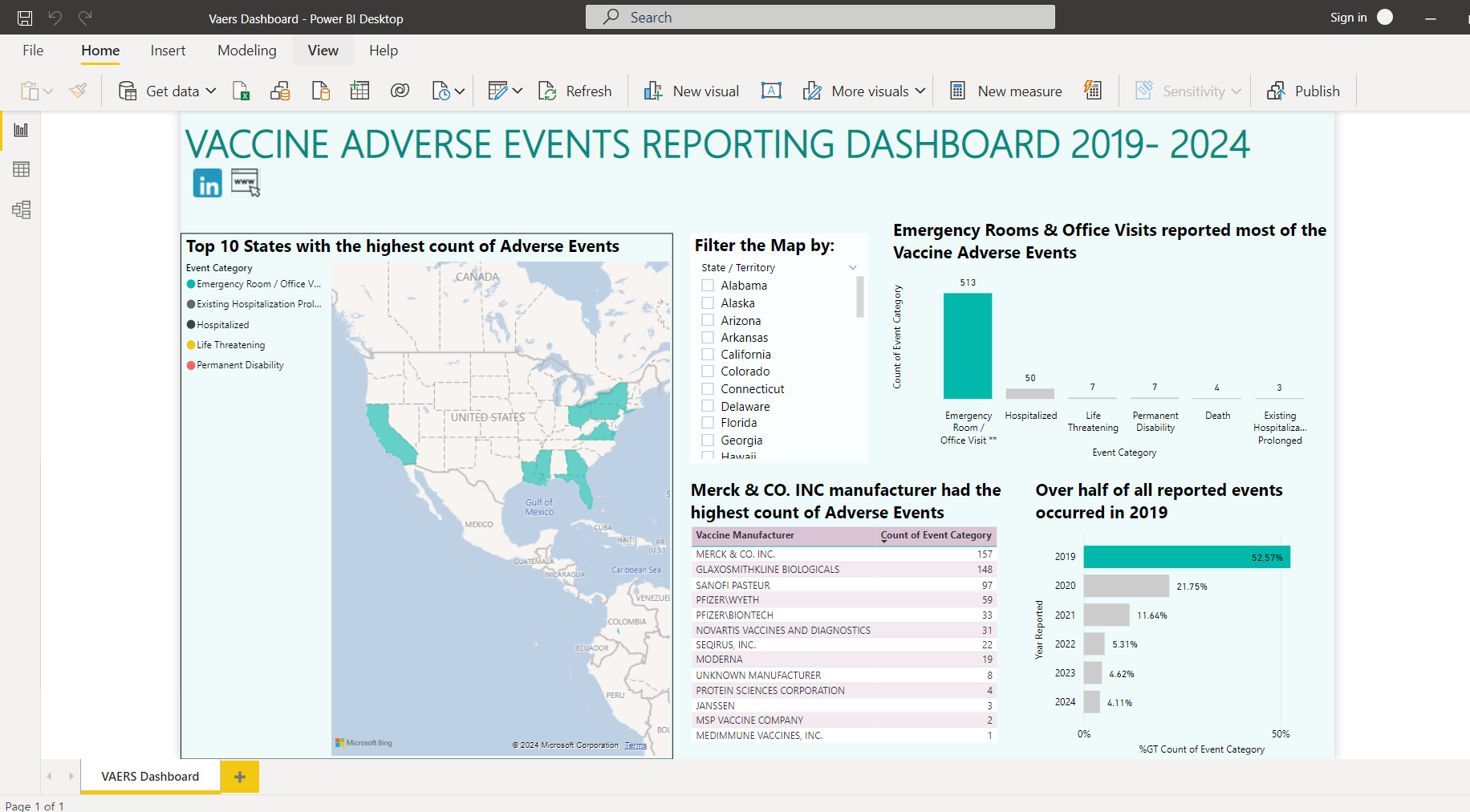
- Top states with the highest number of reported adverse events.
- Manufacturers with the most reports.
- Year-over-year trends and event categories.
Why? Because data-driven insights like these can help public health experts and vaccine makers improve safety and communication efforts.
How I Made It Happen
1. Starting with the Data
I pulled data from the CDC WONDER database, which is an incredible (and free!) resource for public health info. Here’s how I tackled it:
- First, I filtered the dataset by gender—one for male reports and another for female reports.
- I downloaded the data as text files for each group.
2. Prepping the Data
Next, I turned to Excel’s Power Query tool to clean and combine the data:
- Imported the male and female files into separate tables.
- Added a column to each table to label gender.
- Created another column to identify the country (spoiler: it’s all U.S. data).
- Appended the male and female tables into one final dataset, saving it as an Excel file for Power BI.
This gave me a clean, unified dataset ready to analyze.
3. Building the Dashboard
Now for the fun part—turning the data into visuals that make sense at a glance:
Map Visualization: Showcased the top 10 states with the most adverse events.
Bar and Column Charts:
- One chart displayed event counts by year, showing trends from 2019 to 2024.
- Another broke down event counts by manufacturer.
Data Table: A detailed view of event categories and their counts.
The dashboard isn’t just pretty—it’s interactive. You can filter it by demographics, years, and event types to explore the story from different angles.
What the Numbers Are Saying
Here are the key takeaways:
Emergency Care Dominates
Most of the reports (513!) were about emergency room or office visits. These events are urgent but usually not life-threatening, making this category the biggest slice of the pie.Merck & Co., Inc. Tops the Manufacturer List
With 157 adverse events reported, Merck leads the pack. This doesn’t necessarily mean their vaccines are riskier—it could be tied to how often their vaccines are used.2019 Stands Out
Over half (52.57%) of all reports came from 2019. Was it a big vaccination push? A change in reporting practices? That’s worth digging into.California Leads the States
Among the top 10 states, California reported the highest number of events (37), followed by Florida (33) and Ohio (30).
Why This Matters
Projects like this aren’t just about crunching numbers—they’re about using data to make smarter decisions. Public health experts can use insights like these to:
- Investigate trends in high-reporting states.
- Dig deeper into manufacturers with more reports to identify opportunities for improvement.
- Reassure the public that the vast majority of adverse events aren’t severe.
The Takeaway
This project was all about turning complex vaccine data into something that’s easy to understand and explore. Whether it’s identifying trends, pinpointing areas of concern, or just presenting the data in a user-friendly way, dashboards like this help bridge the gap between raw numbers and actionable insights.