Have you ever thought about how stroke hospitalizations might differ across Texas counties? It’s kinda wild when you break it down between hemorrhagic (the bleeding kind) and ischemic (the blockage kind) strokes.
To really examine this, you’ve got to dig into the data to spot regional trends, risk factors, and even how healthcare resources are distributed. This can tell you a lot about why some areas might have different outcomes and what healthcare planners should keep in mind.
This Excel project used:
- power query
- creating a combo chart
- slicers
- dynamic text boxes
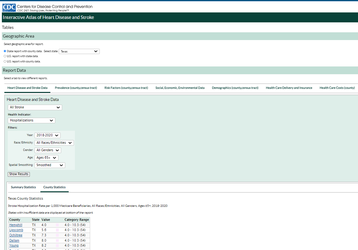
For this, I grabbed some data on stroke hospitalizations in Texas counties. I used the Interactive Atlas of Heart Disease and Stroke to pull “all stroke” data for 2018-2020, focusing on folks 65 and older. I applied filters for all racial and ethnic groups, and I ran them separately for hemorrhagic and ischemic strokes.
Then, I opened Excel and copied the data from the site straight into a spreadsheet. I set up separate worksheets for all strokes, ischemic strokes, and hemorrhagic strokes. After that, I used Excel’s Power Query to combine all the data tables into one. I named it “combinedtable,” closed it, and loaded it into a new worksheet to keep things tidy.
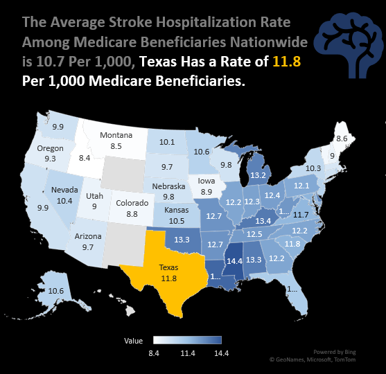
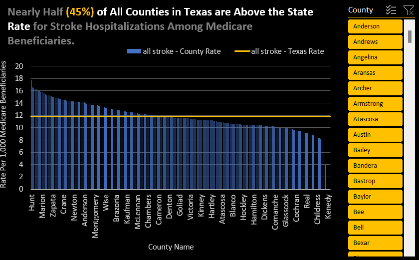
To make things visually pop, I highlighted the state of Texas on the map, drawing attention to the fact that the average stroke hospitalization rate among Medicare beneficiaries nationwide is 10.7 per 1,000. At the same time, Texas sits slightly higher at 11.8 per 1,000. The combo chart I made showed that nearly half (45%) of all counties in Texas have stroke hospitalization rates above the state average for Medicare beneficiaries. I also added a slicer so you can choose a specific county and see how it affects the chart.
At the bottom of the dashboard, there’s a text box with a key stat: 87% of reported strokes were ischemic (2,187 cases), and the other 13% were hemorrhagic (341 cases).
In conclusion, these visualizations and data help paint a clear picture of how stroke hospitalizations vary across Texas. Understanding these differences can guide more targeted healthcare interventions and help allocate resources where needed most. It’s fascinating to see how much insight data like this can provide!